When it comes to construction projects, the erecting of temporary fencing and the ensuing construction process can be an ugly sight. Some people see this as an advantage though, using temporary fencing as a blank canvas to create eye-catching marketing messages and simply beautiful spaces. If done effectively, advertising on temporary fencing and construction sites can improve brand awareness, leading to improvements in overall sales and company performance. Advertising reinforces your brand, product and message and can help give you a cutting edge against the competition.
Here are our top five picks for fantastic banner advertising ideas.
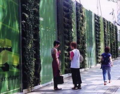
Tokyo Living Wall
Source: Treehugger.com
This construction site in Tokyo is a great example of how you can turn an ugly construction space into something that’s inviting and easy on the eye. In a metropolis like Tokyo, there can never be enough green space so using hoarding to create a welcoming green space is sheer brilliance. The screen alternates between advertisements and pockets of trailing plants. The use of advertisement to break up the green vertical gardens pretty much pays for itself whilst creating a great space to be near.
Dior, New York
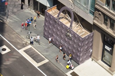
Image: John Madison
A giant purse appeared in NYC when Dior closed for renovations. This is on the extreme level of statement-making for a business going through a construction process… but hey if you’ve got the money why not? It got a lot of coverage and there was a definite build-up of excitement around the new store opening. Highly creative and a fantastic campaign for the build up of a store re-opening.
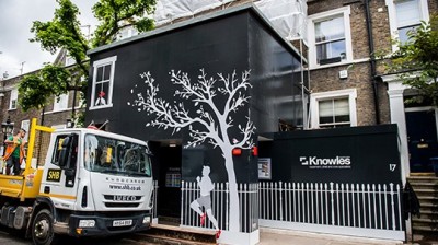
Castelnau, London – Basement Construction
Source: Knowles.uk
This basement construction project by Knowles in the UK uses creative and simple design hoarding to hide what would normally be a very ugly site in a beautiful neighbourhood. By creating such a pretty barrier they’ve kept the area looking neat and tidy and have contained any debris or sediment that may have spilt out into the street and damage nearby property or injured people passing by.
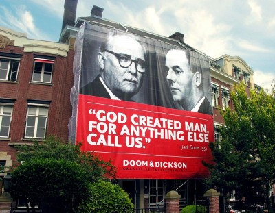
Doom & Dickson, Netherlands
Source: Doom & Dickson, Amsterdam, Netherlands
Whilst undergoing an office renovation, design agency Doom & Dickson used the scaffolding as an opportunity to create a giant advertisement for their agency. The brilliant display is a bold and clever way to draw attention to their creative advertising agency whilst again avoiding an ugly construction site.
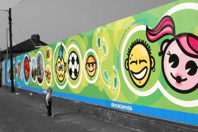
Sean O’Casey Community Centre on St Mary’s Road, Dublin
Source: Behance.net
This piece was commissioned to engage with the community whilst there were ongoing works at the Sean O’Casey Community Centre on St Mary’s Road, Dublin. The idea was to feature fun illustrations that showcase what the art, culture, sports and education centre would be providing. This is a great way to build excitement and curiosity around the renovation process whilst avoiding the public view of the ugly construction process.

Recent Comments